 ×
×
 ☰
☰
In my years of experience in the design industry, there was always one issue that consistently created challenges during the design process: the ability to make design decisions.
Product design must consider many factors, including user flows, managing stakeholders, user interface decisions, technical problems, and timelines. This complexity often makes design decision making difficult.
When we have too many parameters in the UX design process, we may become overwhelmed and unable to make the right decision. This is because with each design choice comes a potential cost or benefit, and it can be hard to determine which outcome is more desirable.
For all designers, making design decisions is a difficult task. Experienced designers should be able to navigate this process better. Still, it can be challenging for junior designers, especially when they lack the confidence to make key decisions independently.
Here, I explain the process and the techniques I use to make decisions more easily in my work so that you can also use them to improve your design decisions.
In design, one of the most important rules that need to be remembered is that we will never know the best solution from the start because we do not fully comprehend the user experience and how the users will perceive the design elements we come up with.
Despite making the best design decisions and considering all design elements, the success of your user experience design cannot be determined until the users interact with the product.
Because of that, it is more effective not to think the achieve the optimal results immediately. Instead, you should focus on understanding the user’s needs and work methodically to find the best solution to meet those needs, leveraging design thinking and all the knowledge you have available at a certain time.
You cannot know the results until you test the prototype and launch the product. You only can estimate, but consider that it is difficult to estimate user behavior.
Taking into account the desired outcomes of your decisions is another important aspect of making decisions.
In basketball, there are certain rules for counting the points, so at the end, a score shows who won and who lost. Imagine trying to determine who wins the game without these rules; it’s impossible.

It is difficult to accurately and confidently know if you made the right decisions without a specific metric or measure of success. This is because, without the ability to measure the outcome of a decision, there is no way to know if the decision led to success or failure.
For example, if you work on a design to reduce the number of users who call the customer success department but you do not have a metric to measure how much the team wants to reduce, you can not evaluate your design.
In other words, without certain metrics (KPI, OKR, etc..), you will never know if your decisions were right, so how can you evaluate your decisions? What can you do better next time?
Many factors complicate the decision-making process, but I think the three I have outlined below are the main ones that can make decisions difficult.
Being scared of making errors is maybe the most common issue when making decisions, and it can slow down decision-making in design work.
This fear can come from different aspects like past mistakes, working in a difficult environment, dealing with many different viewpoints from stakeholders, and managing disagreements within the team.
Previously, I worked with a developer who was very difficult to manage; he would always have a counter-opinion to my ideas. Ultimately, I had limited energy to deal with him.
This made my design process difficult because I always thought about the moment that I needed to show my design to the team and how much energy I would need to devote to it instead of thinking about the right solution.

The biggest obstacle to making the right decisions is the lack of knowledge, which can come from many factors, such as a lack of defining the problem correctly, lack of user research, lack of domain knowledge, and lack of platform knowledge (Mobile, Tablet, Web, etc).
For instance, if you are an expert on the iOS platform, It will not be native for you to work on the desktop platform.
The screen size isn’t the same, the mobile is a touch screen, and the components are not 100% the same.
All this can feel like you are not in control of the platform, making it difficult to make decisions.

If there are no goals and requirements, making decisions can be difficult because it is like working without a framework, so it is essential to design for a specific purpose and add some criteria that help you focus. Additionally, you will need help understanding how to balance user needs and business goals.
If, for instance, the business aims to increase sales (upscale sales) at any possible moment on its website, then perhaps a flow that encourages the user to add more products to their cart would be required (for example, if you buy a flight ticket you know what I mean).
This contrasts with a product that focuses on giving the users the fastest experience possible to finish the task, for example, sending money to another person from your bank account.

There are always daudes when dealing with making decisions. Still, if you follow and apply the points below, you can reduce them, making your decision-making easier.
In my experience, I have seen a pattern in which the designer gets a task without defining the problem and writing the requirements. The manager (PM, CEO, and also a design manager) comes up with an idea that is not explained well and asks the designer to solve it.
Junior designers who lack basic knowledge of concepts and techniques, such as user stories and acceptance criteria, suffer most from this problem. Therefore, they try to work but are unsure of what to do.
To solve this issue, you should ask yourself these questions before working.
For Example, let’s say you work on redesigning an E-commerce checkout process.
What is the problem?
The problem could be a high cart abandonment rate during the checkout process.
Why do we do it?
The company loose money in the checkout process because many users abandoned the cart one moment before paying.
What is the definition of done?
The redesign will be considered “done” when users can smoothly navigate the checkout process, easily input their information, select shipping and payment options, and complete the purchase.
How do we measure success?
Cart abandonment should reduce by 20% at least.
These Four points will give you the framework to start working. You can’t start to work if you don’t answer these questions.
Working without knowing to answer these questions is like entering the car and telling the GPS to go. If you do not tell the GPS where you want to go, it will not know what to do.

When discussing studying thoroughly, I discuss all the aspects you must consider when designing.
It includes the specific area of the product you need to design, the users and their needs, understanding the platform’s requirements (iOS, desktop, etc.), studying the product domain, understanding technical constraints, and more.
The idea is simple: for everything you don’t know, you ask (as simple as you read it). This way, you will have a strong knowledge base to make decision-making easier.
You can learn from articles, YouTube videos, ChatGPT, developers, product managers, and customer success specialists. There is so much knowledge today that you will gain if you force yourself to study.
Another thing to mention is that we often don’t know what we don’t know. To overcome this, I suggest two things.
Firstly, approach the people you work with and find out what information they believe you need to design a solution.
For example, you can consult the developers and inquire about technical issues you may need to become more familiar with. Additionally, you can discuss with the product manager to understand the users better and gather the information they consider important for designing a solution.
Second, you can also rely on ChatGPT to provide points to consider. For instance, if you are working on designing a sign-in flow, you can ask ChatGPT to provide you with key points to consider.

When you have clear requirements and have studied all the information, you can start to design. Honestly, after you do these two things, the design phase should be simpler.
You can now use your pen and paper (or iPad and digital pencil) or open Figma directly to plan solutions to the problems you need to solve.
This is a time for brainstorming multiple potential solutions. By considering various options, you can evaluate their advantages and disadvantages, enabling you to make a better choice. Remember, having more choices can be beneficial as it helps you identify the best solution.
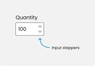
A useful tip for the design process is to immediately write down any questions or ideas that come to mind. For instance, if you include a number input in your design, consider asking:
Writing these questions down instantly makes you less likely to forget important details. Also, finding answers to these questions will increase your decision-making confidence.

Involve the stakeholders (product managers, developers, etc.) throughout the process. You should collaborate with them to design the solution.
Including stakeholders in decision-making will allow you to tap into their expertise and knowledge.
In addition, obtaining their input and approval will ensure everyone is aligned with the product. Furthermore, it will help to reduce the stress of making the decisions alone.
Also, remember that they are part of the product team, and the product is also their product. The product manager should be able to explain the product to customers and company managers confidently, and the developer should agree on what they will develop.
Another tip is to ask ChatGPT for possible questions that stakeholders may ask you so that you can prepare in advance.
Even though usability tests are explained in every UX design course, conducting them before the development phase is not always happening in the real world.
Having said that, if your company is open to making usability tests before the development phase, it will definitely be the best thing you can do to make informed decisions.
You can make a prototype, write a script for the usability test, and test with five users (according to Jakob Nielsen, five users will find almost as many usability problems).
This way, you’ll be able to make decisions in the easiest way possible because you’ll have a lot of real data about the solution.

In this article, I offered a guide to making decisions more effortlessly during the design process based on my eight years of design experience.
Initially, I highlighted the complexity of design decisions, given the many factors to consider, which often leads to feeling overwhelmed. Instead of trying to think of the perfect results from the start, I recommended focusing on user needs and making decisions based on the information available at the moment.
I then detailed three significant challenges in decision-making: fear of mistakes, missing knowledge, and lack of goals and requirements. Lastly, I outlined a five-step approach to simplify decision-making:
Source: UX Planet