6 Contemporary Designs Using CSS with Code Samples for 2023
A web product’s visual appeal can often make or break it. With the continued support from the community and the enhancement of tools, the aesthetics and functionality of CSS designs have improved substantially. This improvement has benefited many businesses by enhancing user experience and engagement, directly leading to the organization’s commercial health. So how can you make the most of CSS designs? Let’s find out!
In this blog post, we will look into the web designing approach and contemporary designs using CSS with code samples.
What are HTML and CSS designs?
HTML (Hyper Text Markup Language) is the infrastructure of the web page, which includes different elements with unique “ids” and “classes,” and CSS, which stands for Cascading Style Sheets, is the construction of the individual elements. Both are vital for developing web interfaces.
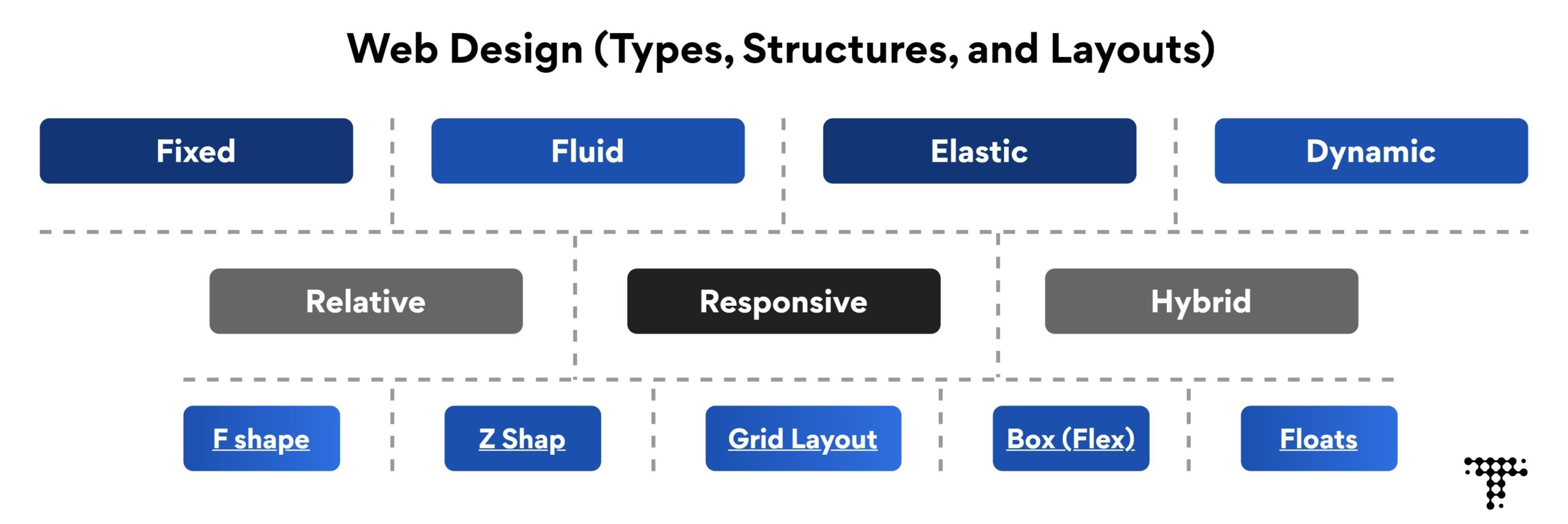
Multiple types of web designs can be created using HTML and CSS.
Also, read: What Is Tailwind CSS? What Is New in Tailwind CSS V3.0?
CSS Design Types
How to create contemporary designs using HTML and CSS?
Building a modern-day website with contemporary CSS designs is no longer a challenging process as you’ve got access to all of the essential tools and frameworks to develop a visually appealing as well as accessible front end.
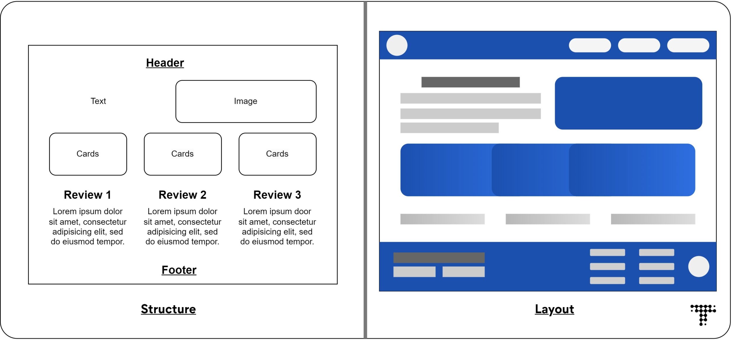
- Organize the layout or structure: To create a contemporary design using CSS, ensure the layout/structure is well organized; it can be on paper or in a graphic design. This reference helps create the infrastructure and design the placeholders for different components and elements.
 Web Design Layout
 - Pick a proper color scheme and fonts: This step is essential to complete before writing the first line of CSS design, as it can take a long time and a different mindset to decide the aesthetics.
- Deciding animations and transitions: Using too many effects in CSS web designs might interfere with the functionality or cause other components to be disrupted. As a result, it is necessary to decide which elements will have which kind of animations.
- Have an open mindset: While designing the front-end layout, functionality is always considered; however, while designing with HTML and CSS, some features may not operate as expected. Having an open approach/mindset is, therefore, essential.
CSS designs with code samples
CSS layouts, structures, and properties can be used to build modern web designs. The ideal design is determined by the website’s specific requirements and goals.
Here are some significant CSS design types and layouts to create a contemporary web design in 2023.
CSS gradient background
Designing a background with the appropriate color scheme is critical for highlighting the elements on the screen. When we utilize Gradient effects on the backdrop, it improves the overall appearance. With a simple CSS design, we can implement a gradient background.
First, we need to provide the background with gradient colors according to the color scheme,
background: linear-gradient (-45deg, #5C54CF, #B34FE0, #FDB721, #FB3443)
Then provide the animation to the background. Here the animation name is changed. We will also provide the duration of the animation.
animation: change 15s ease infinite
After creating the background, we declare the animation with the keyframes rule in our CSS web design.
Here’s the whole code sample for gradient background animation using HTML and CSS.
<!DOCTYPE html>
<html>
<head>
    <title>Animated Gradient Background</title>
    <style>
        body {
            background: linear-gradient(-45deg, #5C54CF, #B34FE0, #FDB721, #FB3443);
            background-size: 400% 400%;
            animation: change 15s ease infinite;
        }

        @keyframes change {
            0% {
                background-position: 0% 50%;
            }
            50% {
                background-position: 100% 50%;
            }
            100% {
                background-position: 0% 50%;
            }
        }

        h1 {
            text-align: center;
            color: black;
            font-family: 'Gordita';
            font-size: 4rem;
            margin-top: 40vh;
        }

        p {
            text-align: center;
            color: white;
            font-family: 'Helvetica Neue', sans-serif;
            font-size: 2rem;
        }
    </style>
</head>
<body>
    <h1>Background Effect with CSS</h1>
    <p>This is an example of an animated gradient background using CSS.</p>
</body>
</html>
Parallax CSS designs
Parallax is a popular contemporary CSS design technique that produces a 3D illusion by animating separate layers at different speeds as the user scrolls. The position of different elements (mostly images) plays a vital role in creating the parallax effect.
Having graphics ready is crucial to start to create this effect.
Here class “parallax-container” will define the section of the web page where the parallax effect will be applied.
.parallax-container {
 position: relative;
 height: 500px;
}

.parallax {
 position: absolute;
 height: 200%;
 width: 100%;
 z-index: -1;
}
The parallax class is used to specify the moving backdrop image. The CSS method translate3d() is used to shift the background pictures up or down based on how far the user has scrolled.
Integrate jQuery (JavaScript) to implement the parallax animation on the containers.
Here scroll event and requestAnimationFrame() optimize performance for a parallax animation effect. To animate background pictures for each parallax element, the loop uses a translate3d() transformation.
$(window).on('scroll', function () {
  window.requestAnimationFrame(function () {
    for (var i = 0; i < parallaxQuantity; i++) {
      var currentElement =  parallaxElements.eq(i);
      var scrolled = $(window).scrollTop();
        currentElement.css({
          'transform': 'translate3d(0,' + scrolled * -0.15 + 'px, 0)'
        })
The overall code of CSS design for the parallax effect:
<!Doctype html>
<html>
  <script src="https://code.jquery.com/jquery-3.6.0.min.js"></script>
  <style>
    .content {
  background: #000000;
  height: 75vh;

  display: flex; /* added display flex */
  align-items: center;
  justify-content: center; /* added justify-content center */
  color: #ffffff;
}

.parallax-container {
  position: relative;
  height: 500px;
}

.parallax {
  position: absolute;
  height: 200%;
  width: 100%;
  z-index: -1;
}
  </style>

<section class="content">
  <h1>Parrllax Effect (Scroll Down)</h1>
</section>

<section class="parallax-container">
  <div class="parallax" style="background: url(https://upload.wikimedia.org/wikipedia/commons/9/98/House_in_forest_%28Unsplash%29.jpg) center center / cover no-repeat;"></div>
</section>

<section class="content"></section>
<section class="parallax-container">
  <div class="parallax" style="background: url(https://upload.wikimedia.org/wikipedia/commons/a/a5/FREMLIN_WALK_MAIDSTONE_NEW_PASTEL_COLOUR_BUILDINGS_%2834691842761%29.jpg) center center / cover no-repeat;"></div>
</section>

<section class="content"></section>
<section class="parallax-container">
  <div class="parallax" style="background: url(https://upload.wikimedia.org/wikipedia/commons/1/18/Grundvig_memorial_church.jpg) center center / cover no-repeat;"></div>
</section>

<script>
var parallaxElements = $('.parallax'),
    parallaxQuantity = parallaxElements.length;

$(window).on('scroll', function () {

  window.requestAnimationFrame(function () {

    for (var i = 0; i < parallaxQuantity; i++) {
      var currentElement =  parallaxElements.eq(i);
      var scrolled = $(window).scrollTop();

        currentElement.css({
          'transform': 'translate3d(0,' + scrolled * -0.15 + 'px, 0)'
        });

    }
  });

});
</script>

</html>
Responsive CSS designs
Responsive design is a no-brainer for designing today’s web products; it’s crucial to implement it in the very first place.
Responsive CSS design aims to produce websites that adjust to various screen sizes and device varieties. The objective is to guarantee that the website appears and performs properly on all platforms, including desktop computers, laptops, tablets, and phones.
Let’s use simple CSS to implement the responsive design on the image and the parallel text.
<!DOCTYPE html>
<html>
<head>
    <meta name="viewport" content="width=device-width, initial-scale=1">
    <title>Responsive Example</title>
    <style>
        .container {
            display: flex;
            align-items: center;
        }
        .text {
            margin-left: 20px;
        }
        img {
            max-width: 20rem;
        }
        @media (max-width: 768px) {
            .container {
                flex-direction: column;
            }
            .text {
                margin-left: 0;
                margin-top: 20px;
                text-align: center;
            }
        }
    </style>
</head>
<body>
    <div class="container">
        <img src="https://upload.wikimedia.org/wikipedia/commons/a/a5/FREMLIN_WALK_MAIDSTONE_NEW_PASTEL_COLOUR_BUILDINGS_%2834691842761%29.jpg" alt="Example Image">
        <div class="text">
            <h2>The Modern Day Life</h2>
            <p>Lorem ipsum dolor sit amet, consectetur adipiscing elit. Nullam vel elit eget elit mollis convallis. Aliquam bibendum tortor non augue laoreet, quis lacinia nisl pharetra.</p>
        </div>
    </div>
</body>
</html>
With the simple use of the viewport property in HTML, the responsive design of the web page can be achieved.
3D CSS web design
CSS designs with 3D effects are getting better and better day by day. The CSS’s frameworks and flexibility allow engineers to create super-effective 3d designs.
A solar system 3D design curated using CSS by Julian Garnier showcases the implementation of different CSS design principles.
This CSS design uses rules like keyframes and media and includes the navigations and transition properties to create a 3d effect.
With different shapes and designing properties of CSS, the solar system with concise accuracy has been created. You can create 3d effects on simple shapes, containers, or text to enhance the user experience.
Typography
Typography in CSS web design simply refers to the visualization of the text; it can be its font, position, and other properties. But here, typography designs using CSS means creating visually appealing text for the user to catch their attention and enhance the overall experience.
Here is an effective code sample for creating aesthetic typography with simple CSS (Resource)
* {
  box-sizing: border-box
 }

 :root {
  --color-1: #186cb8;
  --color-2: #2a9a9f;
  --color-3: #f1b211;
  --color-4: #e83611;
  --color-5: #f9002f;
 }

 .wrapper {
  background: #000;
  line-height: 1;
  min-height: 100%;
  display: grid;
  place-items: center;
  min-height: calc(100vh - 16px);
 }

 h1 {
  font-family: "Exo", sans-serif;
  font-size: 15vw;
  font-weight: 900;
  width: -webkit-min-content;
  width: -moz-min-content;
  width: min-content;
  margin: auto;
  text-transform: uppercase;
  background: linear-gradient(219deg,
   var(--color-1) 19%,
   transparent 19%,transparent 20%,
   var(--color-2) 20%, var(--color-2) 39%,
   transparent 39%,transparent 40%,
   var(--color-3) 40%,var(--color-3) 59% ,
   transparent 59%,transparent 60%,
   var(--color-4) 60%, var(--color-4) 79%,
   transparent 79%, transparent 80%,
   var(--color-5) 80%);
  background-clip: text;
  -webkit-background-clip: text;
  color: transparent;
 }

 .container {
  padding: 1.5rem;
  text-align: center;
  background: radial-gradient(circle at 1.4% 1.4% ,var(--color-1) .8%,transparent .8% ),
   radial-gradient(circle at 5.5% 3%,var(--color-2) .45% ,transparent .45% ),
   radial-gradient(circle at 2.5% 3.5%,var(--color-3) .5% ,transparent .5% ),
   radial-gradient(circle at 4.5% 1.2%,var(--color-4) .25%,transparent .25% ),

   radial-gradient(circle at 98% 98% ,var(--color-1) .8%,transparent .8% ),
   radial-gradient(circle at 95% 95%,var(--color-2) .45% ,transparent .45% ),
   radial-gradient(circle at 94.5% 97.5%,var(--color-3) .5% ,transparent .5% ),
   radial-gradient(circle at 98.5% 95.5%,var(--color-4) .25%,transparent .25% );

 }

 @media screen and (min-width: 768px) {
  h1 {
   font-size: 6.5rem;
  }
 }
Dynamic layout
The dynamic layout refers to the ability of the platform to adapt its visual interface. Various properties such as constraints, flexbox, grid, and dynamic units provide a dynamic layout to a contemporary CSS design. One typical application for dynamic layout is in mobile applications, where users can move between portrait and landscape orientations. In these situations, a dynamic layout helps ensure the user interface remains functional and aesthetically appealing regardless of the device.
In sum
With the right implementation of CSS properties, you can create effective animations, responsive designs, and aesthetically pleasing dynamic layouts. CSS designs and their properties are an important part of web development and will continue to shape the future of web design and user experience.
To stay ahead in this creative and logical field, it is critical to keep up with the latest developments in CSS designs. After all, it comes down to the lasting impression you leave on the user.
Source: Turing

 Blogs
Blogs


